

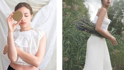
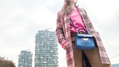
Rose and blue. What are they but two colors that have always been part of our vocabulary \ imaginary? No matter whether you are a woman, caring about nuances, or a man, less prone to details.
One of the biggest problems of globalization is that everything comes to everybody quickly, triggering a damaging process of imitation desire.
Pantone has decreed pink and blue to be ‘the colours of 2016 and all of us are looking forward to rolling around in these two shades. So what if until yesterday – with the attitude of a rebellious teenager – we thought they were childish and almost ridiculous colours?
Rose and blue it’s just an example
Copying has never been an option. Imitating is not a possibility. This happens in all fields. From electronics to fashion. The person who can really succeed now is the one who finds a different key. A new interpretation, a way of looking at things that has never been used before.
“It’s not how good you are, but how good you want to be”
this is the title of a Paul Arden’s book explaining how to succeed, today, in a society that often accepts mediocrity and lower standards than high-aspirers are used to.
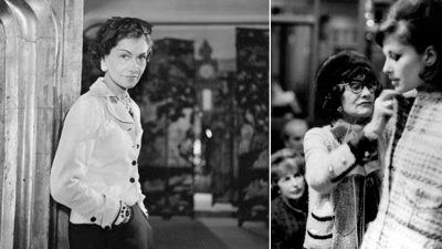
A fact that affects almost everyone. All except one group. Successful people! Those who make it big, and often they do so not because they are incredibly talented, but because they have the courage to believe in themselves and where they are going. Victoria Beckham, as a teenager, wanted to be as famous as popular as Persol soap – very famous in UK. Corny, yes, but a strong enough inner determination to push her towards success.
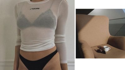
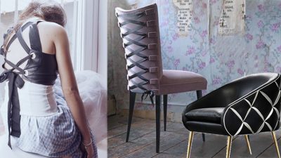
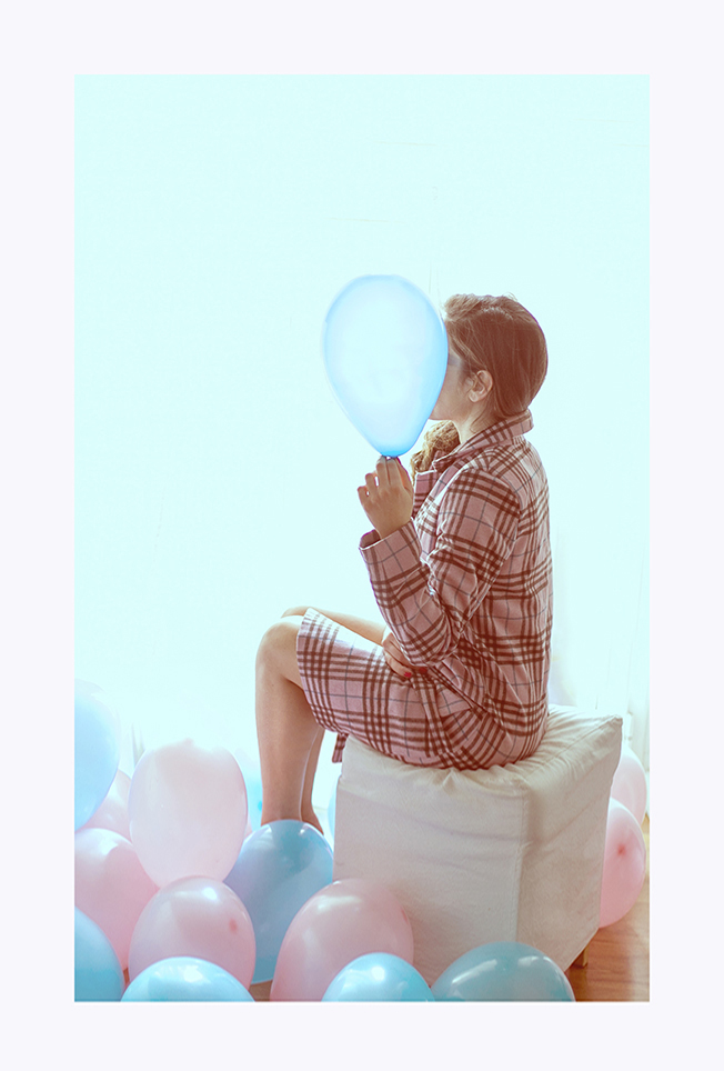
Usual colors with a new meaning, rose and blue
This also happens when someone decides to proclaim pink and blue as the colours of the year. But if these colours have always existed, what’s happened now to suddenly make them so incredibly popular and tremendously trendy?
Well recently Pantone, the company that ranks colours, has crowned them by adding two attractive connotations: rose quartz and serenity { blue is not even mentioned}.
“Rose Quartz and Serenity demonstrate an inherent balance between a warmer embracing rose tone and the cooler tranquil blues, reflecting connection and wellness as well as a soothing sense of order and piece” – Beatrice Wiseman Executive Director, Pantone Color Institut.
So the only way we have to succeed is this: be original or find a new way, however banal it may feel. As if every day we woke up in a completely new body and we had to contend more than ever with our appearance, with our inner selves, seeking the strength to assert our identity in an ever changing situation.
It’s always better to fail in originality, than to succeed in imitation.
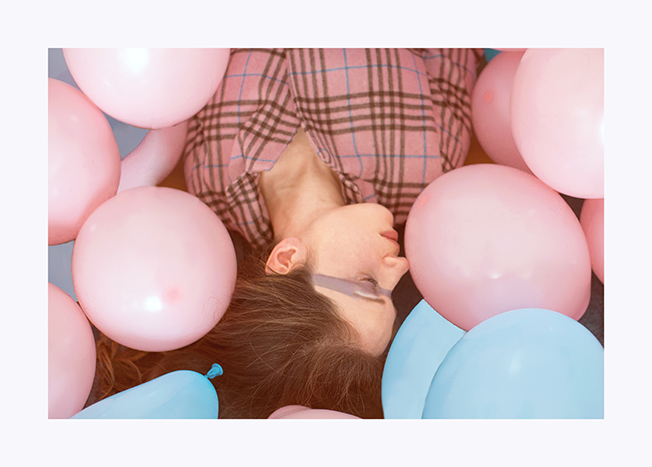
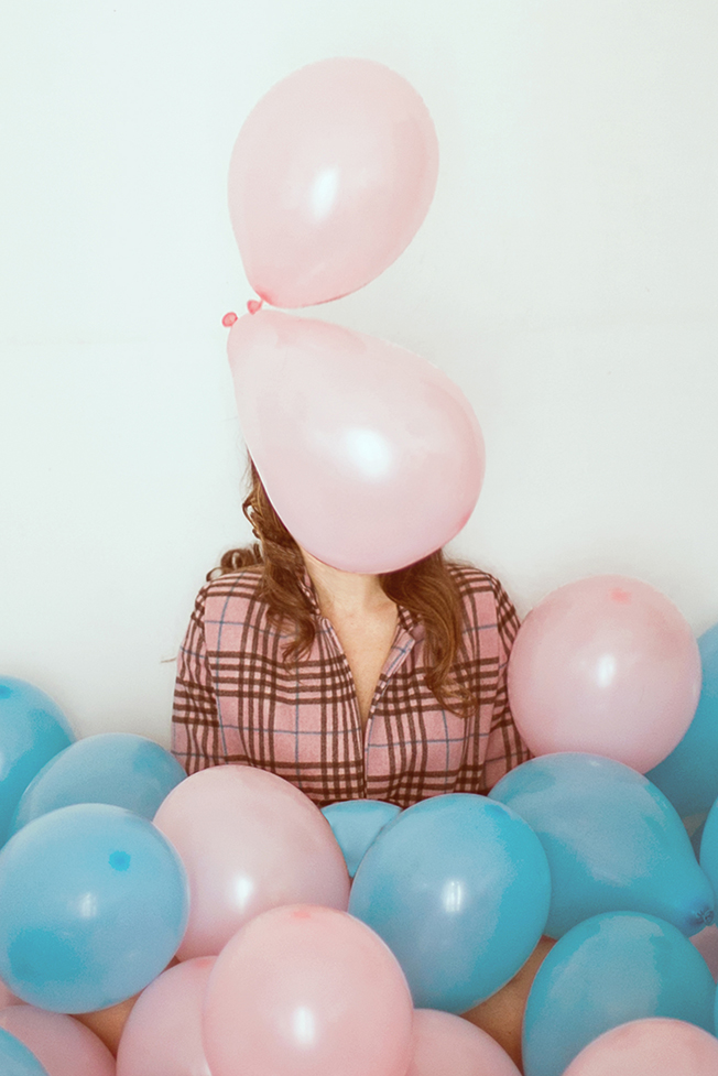
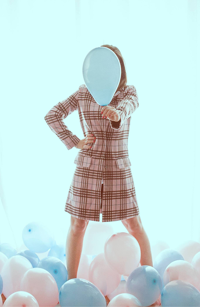
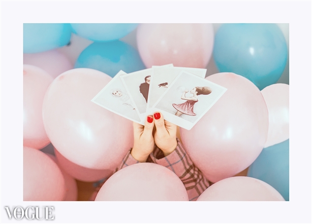
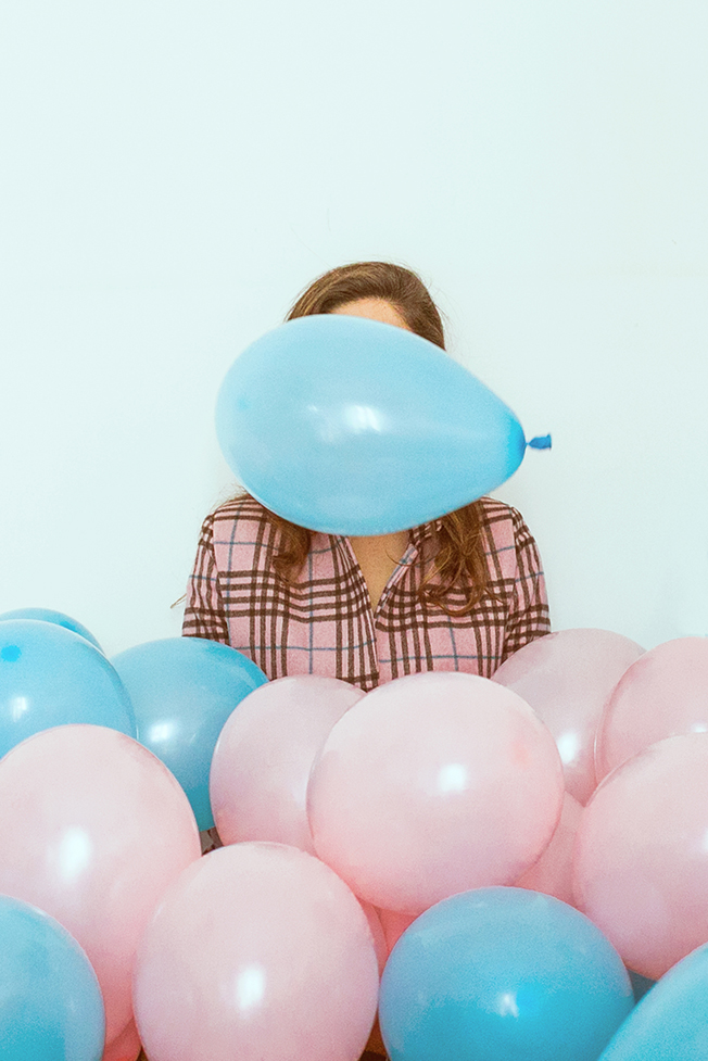
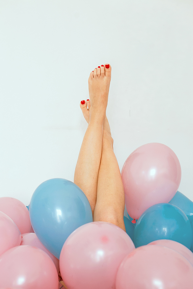
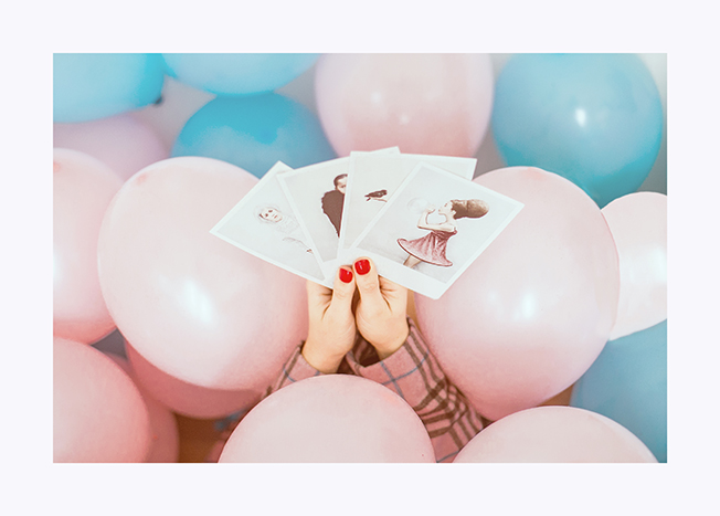
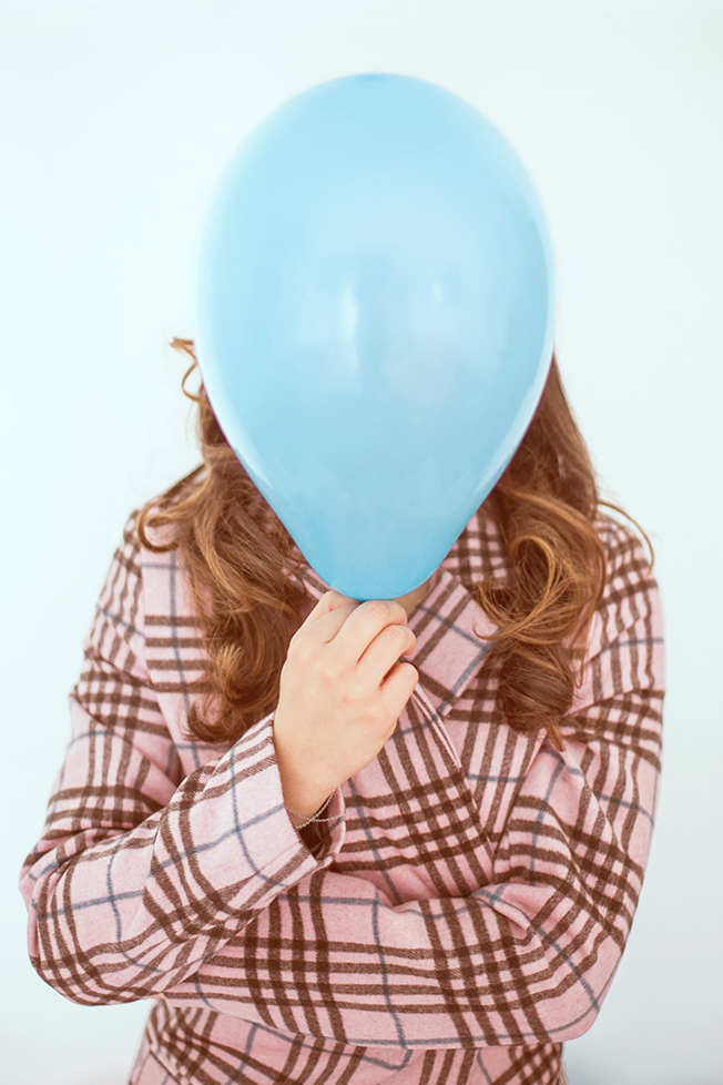
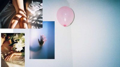
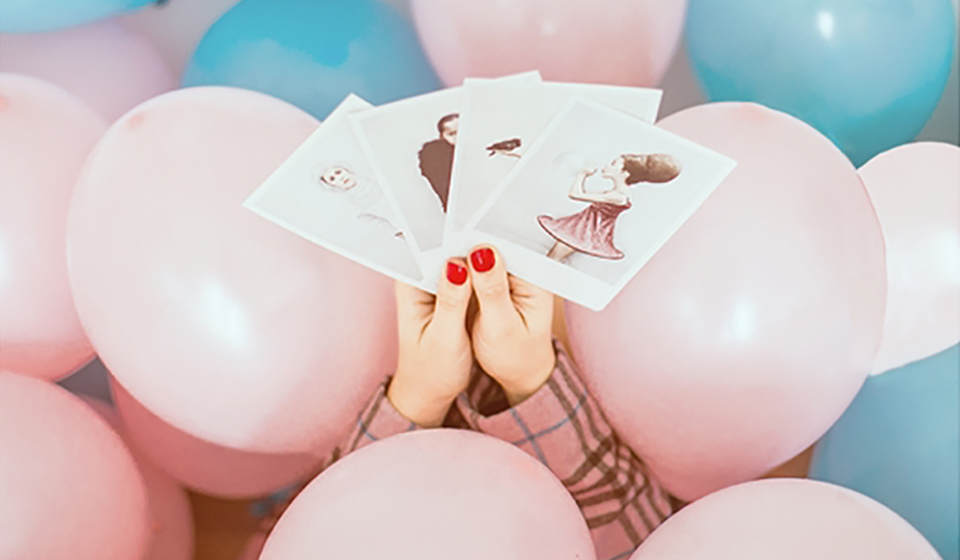
Photo by Elisa Rinaldi Fotografa pubblicate da Vogue Italia
Comments
26 Responses to “Rose and blue: colors of ever, colors of the year”
I love your selection of images to accompany this post – the two colours work so well together and this really shows that! Seeing people write about the shades has really inspired me lately, I’m keen to inject my wardrobe with a splash of pastel pink 🙂
aglassofice.com
x
I’m wearing the color of the year in my post today, too! 🙂 Happy Tuesday!
-Ashley
Le Stylo Rouge
Love your posts and your images are always so inspiring!
xx
http://www.mybeautrip.com
Concordo con te sull’originalità nel proporre qualcosa, è alla base di ogni idea di successo!Il rosa quarzo e il blu serenity mi piacciono tantissimo,da quando qualche mese fa ho letto uno dei primi articoli su questi colori ho pensato subito potessero avere successo!
Stupende le foto!
Baci
Eloise
http://www.fizzyfashion.com
I love the colors… so beautiful photos!!! xxx
stylentonic.com
Gorgeous photos dear! Love the colors!
http://theavantguardian.com/
Charming photos, rose and blue are lovely colors…
besos,
M
The Flower Duet
che meraviglia queste foto
buona serata
<<< tr3ndygirl fashion blog >>>
MOLTO CARINA!!!
ripasso per un salutino … baci
http://www.unconventionalsecrets.com/
True… if others say something is not good and you feel is good, it’s not that they are right… you are right because you see it that way and they are blind to it… the photos are awesome… and the theme is nice as well… be original, believe in something you feel something strong about they are few stuff to be sucessful in life!!
http://howtogetridofstuf.com/
Mi sembra che in fatto di originalità tu abbia decisamente vinto 🙂 Bellissima l’idea dei palloncini, foto fantastiche e poi che dire… a me questi colori piacciono molto!!!
The Princess Vanilla
Nice post! Your outfit is so pretty!
xx
Mademoiselle Coconath
http://mllecoconath.com
I love these shades, perfect for upcoming spring!
Have a lovely weekend:)
Rosanna x
The colors are just darling and the images show them off so well! I agree that reinventing something that was already good to begin with can create such a fresh take on it that people can help but be drawn to it. Well written dear!
xx,
Tania
http://inspiremyfancy.blogspot.com/
These pastel colours are such an amazing inspiration!
http://fashion-soup.com/
Amo questi due colori!
Un bacione,
Mary
http://fashionsecretsofaprettygirl.blogspot.it/
Such a great look!
http://www.yukovablog.co.uk/
Nice post and pics!
Nice pics!
kisses…
Zapatos Rojos
I really love you 🙂 Happy New Year!
Can you follow me? I follow you 🙂
If you comment my post, I will comment your five posts! 🙂
http://www.sandrakopko.com/2016/02/opened-sweater.html
I just love those 2 colours and they work so well together!
Da quando Pantone ha proclamato questi due colori i colori del 2016 ho iniziato a sperimentare un po’ di accostamenti e se fino a ieri non avrei mai pensato di poterli abbinare, oggi devo dire che amo alla follia questo mix, così delicato ma anche originale e a tratti stravagante.
Queste foto una bomba come spesso accade in questo blog!
Baci
Eli
http://www.blackstarstyle.com
wonderful photos :).
xo
Priscilla
Adoro questi due colori e queste foto sono fantastiche!
kiss kiss
http://thepinkillusion.blogspot.com/
Beautiful outfit! 🙂